Guides
Web Page Elements
-
Images
Provide text equivalents for all images with communicative value. -
Keyboard Accessibility
Be sure people can navigate web pages using just a keyboard, no pointing device. Additionally, be sure there is a visible indication of where keyboard focus is. -
Accessible Multimedia
Ensure that all videos embedded in web pages or linked to from web pages are captioned. Provide transcripts for all audio files. -
Heading Styles
Structure documents by applying heading styles in a logical order. -
Color
Never use color alone to communicate. -
Contrast
Use good contrast. -
Hyperlinks
Create hyperlink text that makes sense out of context. -
Flashing, Blinking and Strobing
Avoid creating or linking to any web content that flashes, blinks, or strobes. -
Timing
Avoid timed responses unless the user has sufficient notice to request more time, as appropriate. -
Lists
Use the numbered list (ordered) and/or bulleted list (unordered) features to emphasize points or communicate sequence. -
Complex Tables, Forms, and Interactive Content
Get support from SMC experts for creating complex tables, forms, and interactive content. -
Good Design
Apply good design principles to web pages.
Images
Tip: Include alternative text for all images with communicative value. This alternative text ("alt text") must be a brief, concise description of the image in the context of the web page. Provide longer descriptions for more complex images. Images only for decorative purposes should be examined to see whether it is of value to the text on the web page.
Process to Add Alt Text and Longer Descriptions
Text within Images
Rationale for Providing Text Equivalents for Images
Examples of Alt Text
Additional Resources
Process to Add Alt Text and Longer Descriptions
Adding Alt Text with CANVAS
-
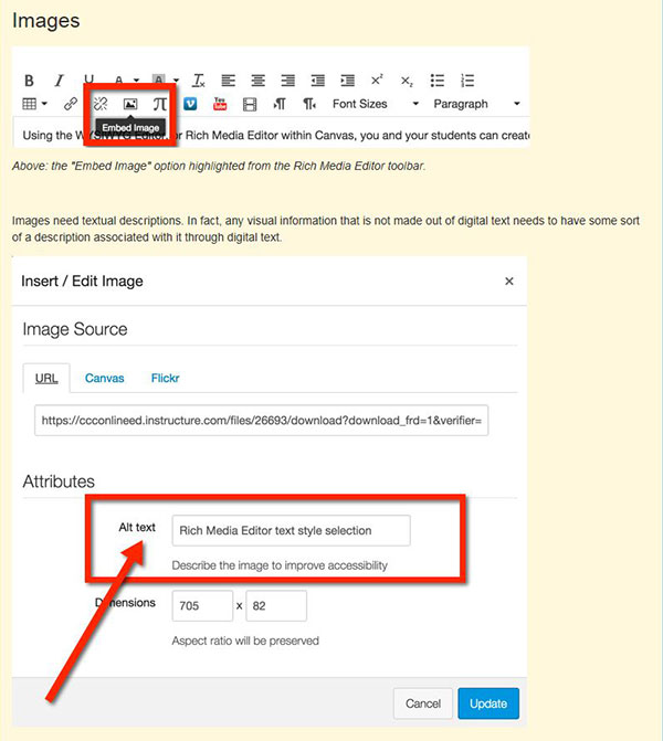
Insert an image beginning with clicking on the Embed Image icon in the Rich Media Editor toolbar.
-
Add alt text in the Alt text edit box within the Attributes controls in the Insert/Edit Image dialog box.
Longer Descriptions
Complex images that require lengthy text descriptions (e.g. graphs and charts) also need brief alt text to describe its basic function and then provided with longer text descriptions within the web page or a linked web page.
Text within Images
Avoid using text in an image versus actual text. Screen readers cannot read text in an image and text in the image becomes blurry when enlarged. Additionally, the text is more difficult to edit and may result in longer downloading time.
Rationale for Providing Text Equivalents for Images
Many people who are partially sighted and all people who are blind interact with web pages by listening to them with screen reading software (opens in new window) and/or feeling the content through a refreshable Braille display (opens in new window) .
People listening to the web using screen readers or Braille displays can only hear or feel text, not images. Therefore, each image needs to be described with text. All web authoring tools used at SMC facilitate adding text to describe images. This text is called alternative text (or alt text). Thoughtful alternative text provides a succinct description of the image’s function and reflects the context in which the image has been placed.
Examples of Alt Text and Long Description
Below are examples of alternative text for the same image of Winston Churchill used in two different contexts.

First Context: Web page on hats worn by well-known historical figures
Alt Text: Winston Churchill wearing his signature Homberg hat
Second Context: Web page on Cuban cigars
Alt Text: Churchill smoking his favorite Cuban cigar, Romeo y Julieta
Complex images that require lengthy text descriptions (e.g., graphs and charts) should be given alt text to describe its basic function and then provided with longer text descriptions within the web page or a linked web page.
Below is an example of alt text contrasted with a longer description of a Kandinsky painting.

Alt Text: Wassily Kandinsky, Composition 8, 1923
Example of a Longer Description:
Kandinsky shows the evolution of his style while an instructor in the new regime surrounded by Russian avant-garde artists like Kazimir Malevich. The gestural, linear quality of Kandinsky’s work is here replaced by a strict linear and geometric style prevalent in Suprematism and Russian Constructivism
Additional Resources
WebAIM Alternative Text (opens in new window)
Keyboard Accessibility
Tip: Make sure people can navigate web pages using just a keyboard, with no pointing device. Also make sure a visible indication of the keyboard focus is noticeable.
Keyboard Accessibility Evaluation
Rationale for Keyboard Accessibility
Additional Resource on Keyboard Accessibility
Keyboard Accessibility Evaluation
Use these keyboard commands to test web pages for keyboard accessibility.
-
Press the Tab key to move forward through links and forms.
-
Press Shift + Tab to move backwards through links and forms.
-
While tabbing, make sure the focus moves through the page in a logical order. Navigate as if
-
While tabbing, make sure there is a visual indication of the selection on the page. In the image below, it is visible in the list of links which link has the keyboard focus because there is a dashed-line rectangle around it.

-
Press Enter (Return) key to activate links and buttons.
-
Press the spacebar to activate check boxes and buttons.
-
Use the arrow keys to control radio buttons, select/dropdown menus, sliders, tab panels, autocomplete and tree menus.
-
If a mouse action displays any page content (e.g. fly-out menu), make sure the same content is available using the keyboard.
-
Press Esc to close any dialog box.
-
Check the reading order of tables. It should proceed from left to right across the first row and move to the first cell in the second row, etc.
Special Note for Using a Mac OS
When evaluating keyboard accessibility with a Mac, turn on keyboard access for all controls.
-
Open System Preferences and choose Keyboard.
-
Click the Keyboard Shortcuts tab and activate All Controls radio button.
Rationale for Keyboard Accessibility
Some people (e.g. people who are blind) interact with computers by keyboard alone. They do not use a mouse or any other pointing device.
Additional Resources for Keyboard Accessibility
Accessible multimedia
Tip: Make sure all videos embedded on web pages or linked from web pages are captioned. Provide transcripts for all audio files.
Support for Captioning
Rationale
Support for Captioning
Canvas
To integrate multimedia into Canvas courses, read the following information excerpted from the Canvas FAQ, Spring 2016. For support, contact Distance Education Multimedia Specialist Christine Miller (x3765, miller_christine@smc.edu) or Alternate Media Specialist Aaron French (x8934).
How does media storage work on Canvas?
If the Real Streaming format of videos was used on eCollege, they will not migrate over to Canvas from eCollege. To continue using these resources, contact Christine Miller.
For other types of video (.mp4, .mov, .wmv, .m4v or .flv), these should migrate over successfully to Canvas as long as it was output as a video file using programs such as Camtasia, Adobe Captivate or Articulate.
If video files are linked from outside websites, such as YouTube or Vimeo, the links and embedding should copy over. Make sure these did not break in the copy process.
Moving forward, all faculty members are encouraged to set up an account with 3C Media Solutions for all video/multimedia needs because Canvas has limited media storage.
Once a 3C Media account is set up with an smc.edu email, contact Christine Miller to be added to the 3C Media Santa Monica College Group account where faculty members can upload videos directly to 3C Media and request free captioning. Turnaround is about 1 week, depending on the video duration, time of the request, and if a transcript is provided. To upload video content to 3C Media Solutions, the file must be in a digital format. For assistance digitizing content, contact Christine Miller.
Benefits of using 3C Media solutions:
-
Free, closed captioning service. Fast turnaround.
-
Unlimited storage. Canvas default media storage size is smaller than eCollege, so 3C Media is a digital file cabinet for all digital resources.
-
Any type of file is storable in 3C Media.
-
Find and use existing content in the shared SMC Group folder.
Rationale for Captioning
All multimedia must be captioned, and all audio files need to be accompanied by a transcript to accommodate people who are deaf/hard-of-hearing.
-
If there is a deaf/hard-of-hearing student and chosen multimedia is not captioned, this multimedia cannot be shown or assigned.
-
If there is a deaf/hard-of-hearing student and online multimedia is not captioned, links to that multimedia need to be inactive until the captioning is completed.
-
Exception: No students need captioning if an accommodation and the multimedia will be used for the current class ONLY (e.g., YouTube video on a current event).
Heading Styles
Tip: Structure document by applying heading styles in a logical order.
Creating Headings
Rationale
Creating Headings
Canvas
-
Select text.
-
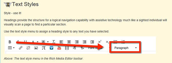
Open the Paragraph options from the Rich Media Editor toolbar, and choose the heading level.
Special Note: Reserve heading level 1 for the title of the page.
Rationale
Providing clear section titles with heading styles makes it easy for people to understand information in an easy-to-understand manner. It also makes it possible for blind people listening to web pages when screen readers use heading styles to navigate a web page.
When sighted people look at the web page below, they immediately know the title is Producing Chocolate, the first major section is Harvest, the second major section is Fermentation and Drying because these titles are stylized consistently and also labeled as well.
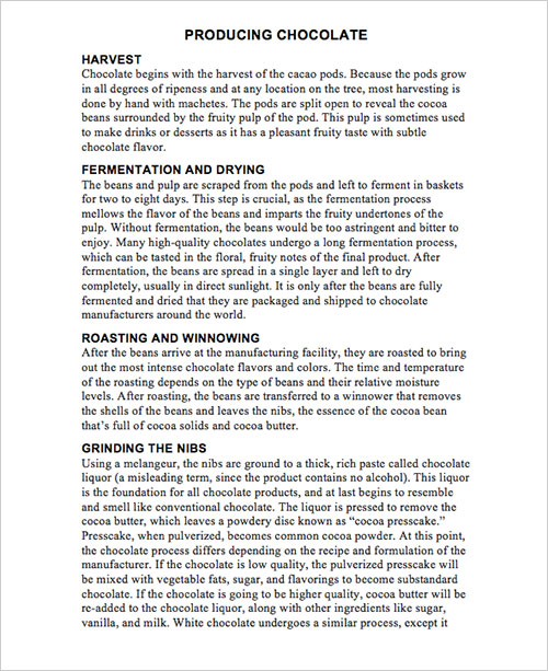
How can a visually impaired individual understand this page? Structure the page with consistent headings (H1, H2, H3 and H4.) created using the Styles feature accessible through the Home Ribbon on Microsoft Word. (Refer to How-To section)
Headings are titles given to sections of a document or web page. The title of a web page is usually considered the top level heading otherwise known as heading 1. The major document section titles are known as heading level 2. For example, the document about how chocolate is produced is called “Producing Chocolate.” The title “Producing Chocolate” is a heading level 1. The titles of the major sections (Harvesting, Fermentation and Drying) are classified as heading level 2.
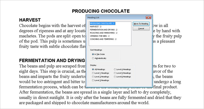
Well-structured headings enable visually impaired people who are listening to the web with screen reading software to hear an outline of the document. Below is an image of what screen readers read aloud when prompted to provide the heading structure of the same page, Producing Chocolate. And this allows screen reader users to navigate efficiently to their section of choice.
Color
Tip: Never use color alone to communicate.
Rationale for not using color alone to communicate.
Use of Color Examples
Color Blindness Simulators
Rationale for Not Using Color Alone to Communicate Information
People who are color blind or severely visually impaired cannot visually discriminate on the basis of color.
Use of Color Examples
Inaccessible Use of Color
The new vocabulary words are listed below. The words in red will definitely be on the test.
-
diffident
-
homeostatis
-
diabesis
-
prolix
-
sagacious
All homework is due before the exam.
Accessible Use of Color
The new vocabulary words are listed below. “Diffident” and “prolix” will definitely be on the test.
-
diffident
-
homeostatis
-
diabesis
-
prolix
-
sagacious
All homework is due before the exam (Bold and italic are used in addition to color to make "before" stand out.)
Color Blindness Simulators
Color Blindness Vision Simulator (opens in new window)
Contrast
Tip: Use good contrast.
Rationale
Examples
Color Contrast Standard
Color Contrast Analyzer Tools
Additional Color Contrast Resources
Rationale
Good contrast is mission critical for many people who are visually impaired and simply good design for everyone.
Examples
Good Contrast
Questionable Contrast
Poor Contrast
Color Contrast Standard
SMC must comply with web accessibility design standards in the Web Content Accessibility Guidelines 2.0, Conformance Level AA. These standards require a contrast ratio between foreground text and background of 4.5:1 for normal text and 3:1 for large text (14 point and bold or larger, or 18 point or larger).
In general, if the contrast is in question, assume it is not. To confirm whether a contrast ratio complies with standards, use a color contrast analyzer tool.
Color Contrast Analyzer Tools
-
An excellent color contrast evaluation tool is incorporated into the Web Accessibility Toolbar for Internet Explorer (opens in new window) by Vision Australia and the Paciello Group. The Colour Contrast Analyzer is available separately from Vision Australia.
Additional Color Contrast Resources
Color and Contrast on Web Pages (opens in new window)
Hyperlinks
Tip: Create hyperlink text that makes sense out of context.
Process for Creating Hyperlink Text
Rationale for Creating Hyperlink Text that Makes Sense out of Context
Examples of Accessible and Inaccessible Hyperlink Text
Process for Creating Hyperlink Text
Creating Hyperlinks with SharePoint
-
Select link text.
-
Choose the Insert tab from the Editing Tools options.
-
Click the Link button, choose SharePoint or From Address, and provide the URL link and description for the link.

Creating Hyperlinks with Canvas
-
Select link text.
-
Choose the Link icon from the Rich Media Editor toolbar, and add the address.
![]()
Rationale
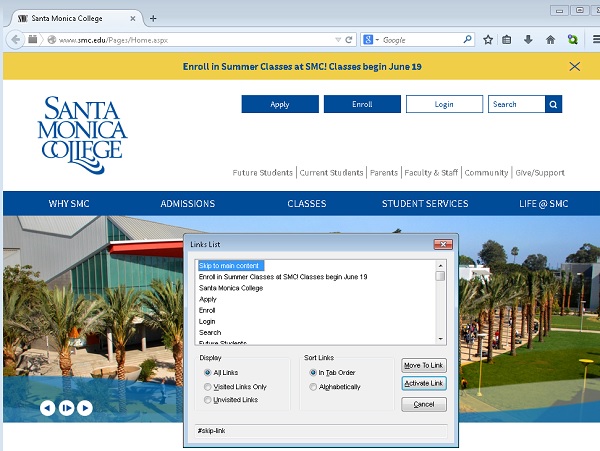
Creating link text that makes sense out of context is important because screen reader users will be able to listen to a list of all links extracted from a web page and navigate within that list by first letter. Listening to a list with items like “Click here” or “More” is not helpful.
Below is an image of a screen reader’s link list. A blind user listening to a web page navigates through the list using up and down arrow keys and/or by typing the first letter of the link needed.
Accessible and Inaccessible Examples
Unclear Link Text
Click here to go to the Getty Museum.
Usable Link Text
For more information, go to the Getty Museum website.
Additional Resources on Link Text
Link Text from Penn State Accessibility (opens in new window)
Flashing, Blinking and Strobing
Tip: Avoid creating or linking to any web content that flashes, blinks, or strobes.
Rationale for avoiding flashing, blinking and strobing
Additional Resources on Flashing, Blinking and Strobing
Rationale
These features can trigger seizures.
Additional Resources on Flashing, Blinking and Strobing
Web Aim Seizure Disorders (opens in new window)
University of Minnesota Blinking Elements and Marquees (opens in new window)
Timing
Tip: Avoid timed responses unless the user has sufficient notice to request more time.
Canvas and Extended Time
Rationale for Avoiding Timed Responses or Providing Timing Accommodations
Canvas and Extended Time
Faculty is responsible for providing extended time on all quizzes and exams on Canvas. Providing this accommodation in Canvas is simple and does not require altering testing time for all students. Faculty must remember to extend the test time on each quiz/exam for students who need extended time.
Visit “Once I publish a timed quiz, how can I give my students extra time?” (opens in new window) for information on how to add extended time for students. For assistance, contact the Canvas Support Hotline at (844) 243-8408 or email the SMC Canvas mentors at canvasmigration@smc.edu.
Rationale for Avoiding Timed Responses or Providing Timing Accommodations
Some people with disabilities may require extra time to process information and/or navigate websites.
Lists
Tip: Use the numbered list (ordered) ![]() and/or bulleted list (unordered)
and/or bulleted list (unordered) ![]() features to emphasize points or communicate sequence.
features to emphasize points or communicate sequence.
Examples of Lists
Rationale for Using the Lists Features
Examples of Lists
Foods High in Antioxidants (opens in new window)
-
Purple, red, and blue grapes
-
Blueberries and red berries
-
Nuts
-
Dark green veggies
-
Sweet potatoes
Top 5 Livable Cities in the United States (opens in new window)
-
Denver, Colorado
-
Austin, Texas
-
Fayetteville, Arkansas
-
Raleigh-Durham, North Carolina
-
Colorado Springs, Colorado
Rationale for Using the Lists Features
When using the numbered list and/or bulleted list features, screen reading software used by blind people announces the presence of list items and, depending on the context, how many items are in the list.
Complex Tables, Forms, and Interactive Content
Tips
-
To create pages with complex tables, forms, and/or interactive content, consult a campus expert.
-
To help students access information from complex tables, complete forms, or engage with interactive web pages, determine if these features are accessible.
-
Do not merge, nest or split table cells.
-
Provide titles and summaries for tables.
Rationale
Example of Simple and Complex Table
Support for Using Complex Tables, Forms, and Interactive Content
Rationale
Creating accessible complex tables, forms, and interactive web content requires complex HTML coding.
Table Examples
Example of Simple Table
In a simple table, there is only one header column and one header row.
Types of Chocolate and Their Cacao Content
| Chocolate Type | Cacao Content |
|---|---|
| Unsweetened chocolate | 100% chocolate |
| Dark chocolate | 30 to 80% cacao content plus sugar, vanilla, and lecithin (emulsifier) |
| Bittersweet chocolate | At least 35 to 80% chocolate liquor plus cocoa butter and sugar |
| Semisweet | In USA refers to chocolate that is darker than sweet chocolate, but sweeter than bittersweet |
| Milk chocolate | 10-20% chocolate liquor plus cocoa butter, sugar, and at least 12% milk in some form |
| White chocolate | At least 20% cocoa butter, about 14% milk and sugar |
Example of Complex Table
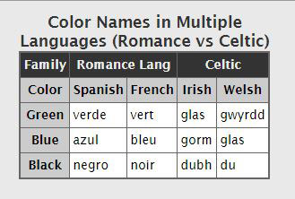
In a complex table each data cell refers to more than just one row header and one column header. For example, in the table below, “verde” means “green” in “Spanish,” AND it is a “Romance Language.”
Color Names in Multiple Languages
This table provides the words for “green,” “blue,” and “black” in the Romance languages Spanish and French. It provides words for the same colors in the Celtic languages Irish and Welsh.
Credit: Accessibility and Usability at Penn State, Complex Table Example (opens in new window)
Support for Using Complex Tables, Forms, and Interactive Content
Omni CMS
- Paul Trautwein, Web Content and Social Media Manager, x4204
Canvas
Email Canvas mentors and Distance Education staff at canvasmigration@smc.edu.
Support for Evaluating the Accessibility of Complex Tables, Forms and Interactive Content
-
Elena Throckmorton, Disabled Student Services, x4267
-
Lisa Courto, Disabled Student Services, x4267
Good Design/Fonts
Tip: Apply good design principles to all web pages.
Some Good Design Principles
Rationale
Additional Resources on Accessible Print Design
Some Good Design Principles
-
Avoid tiny fonts.
-
Choose easy-to-read, simple fonts (e.g., Verdana, Arial, or Georgia vs. Brushscript MT or Impact.
-
Use appropriate white space between lines and paragraphs to facilitate reading.
-
Allow user to skip over repetitive or lengthy list of links.
-
Be sure the page is readable and navigable when zooming in or out.
Rationale
Applying good design principles facilitates navigation and comprehension of pages for everyone.
Additional Resources on Accessible Print Design
WebAIM Fonts (opens in new window)
Checking for Accessibility
Web Accessibility Toolbars
Web Accessibility Toolbar for Internet Explorer (opens in new window) by Vision Australia and the Paciello Group
Wave Chrome Extension Web Accessibility Toolbar for Mac OS or Windows (opens in new window) by WebAIM
Color Contrast Analyzer Tools
-
An excellent color contrast evaluation tool is incorporated into the Web Accessibility Toolbar for Internet Explorer (opens in new window) by Vision Australia and the Paciello Group. The Colour Contrast Analyzer (opens in new window) is available separately from Vision Australia.
Additional Resources on Creating Accessible Web Pages
The National Center on Disability and Access to Education Cheatsheets
PDF Format of Presentations by Jared Smith, Associate Director of WebAim, Santa Monica College, October 2, 2014
Implementing an Accessibility Policy (opens in new window) : An Insider's Guide by Lucy Greco and Anna Gazdowicz
Other Colleges
University of Washington, 30 Web Accessibility Tips (opens in new window)
Portland Community College Accessibility for Online Course Content (opens in new window)


